- HOME PAGE
- / BLOG
BLOG

The Art of Harmonizing Wood Tones: Oak, Walnut, Chestnut – Which One Belongs Where?
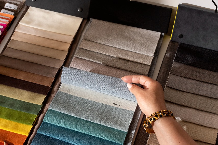
In interior design, wood is one of the most timeless and emotionally powerful materials.
It adds warmth, character, natural beauty and a sense of grounding to any space.
But choosing the right wood is not just about liking a color—tone, texture, grain movement and lighting conditions dramatically change how wood behaves in a room.
Among all wood options, oak, walnut and chestnut stand out as the three most commonly used types.
Each has its own personality, and each works best in different areas depending on the mood you want to create.
Used correctly, they elevate a space instantly; used incorrectly, they disrupt the entire aesthetic balance.
In this guide, we explore the characteristics of each wood type, where they should be used, and how to create harmony between them.
🪵 1. Oak: The Essential Choice for Modern, Bright and Minimal Interiors
Oak is known for its light, creamy tones and soft, subtle grain structure.
It brings clarity and freshness to a space, making it the perfect base for modern interiors.
The character of oak
- Light and airy
- Soft grain movement
- Warm yet minimal
- Ideal for Scandinavian and contemporary styles
Where to use oak
1. Modern and minimal homes
Its brightness complements clean lines.
2. Small apartments
Light tones visually enlarge the space.
3. Bright living rooms
It reflects natural light beautifully.
4. Kitchen cabinetry
Creates a clean and natural look.
5. Bedrooms
Promotes calmness and a soft atmosphere.
Best color pairings with oak
- White
- Beige
- Gray
- Soft greens
- Pastel hues
Oak acts as a neutral, balancing base—perfect for calm, uncluttered interiors.
🌰 2. Walnut: Depth, Elegance and Strong Character
Walnut is instantly recognizable with its rich brown tones and expressive grain patterns.
It brings a sense of luxury and sophistication into interiors.
The character of walnut
- Deep brown shades
- Strong grain movement
- Warm, dramatic and elegant
- A symbol of premium design
Where to use walnut
1. Living rooms and TV units
Adds depth and visual richness.
2. Home offices
Creates a serious, professional atmosphere.
3. Large spaces
Its dark tone looks best in roomy interiors.
4. Kitchen islands and vertical surfaces
Makes the space feel high-end.
5. Luxury-modern concepts
Pairs exceptionally well with marble, bronze and black tones.
Best color pairings with walnut
- Charcoal
- Black
- Bronze
- Petrol green
- Navy blue
- White marble
Walnut is ideal when you want to create presence, elegance and strong visual identity.
🌰 3. Chestnut: Natural Warmth with a Soft Rustic Touch
Often underrated, chestnut is actually a wonderfully balanced wood tone.
Its medium brown shade and gentle warmth allow it to fit naturally into many design styles.
The character of chestnut
- Medium, warm brown
- Soft natural variations
- Cozy, approachable, organic
- The perfect middle point between light and dark woods
Where to use chestnut
1. Homes with a natural or biophilic style
Its organic feel blends beautifully with plants and earthy tones.
2. Living room furniture
Adds depth without overwhelming the room.
3. Wall or ceiling cladding
Brings warmth and texture to architectural surfaces.
4. Kitchen cabinets
An excellent choice for warm, welcoming kitchens.
5. Entryways
Creates a soft, friendly first impression.
Best color pairings with chestnut
- Beige
- Terracotta
- Olive green
- Light gray
- Earthy tones
Chestnut shines in spaces where comfort and naturality are the focus.
🎨 4. Can These Three Wood Types Be Used Together?
Yes—absolutely.
But the key is using them in the right proportion and hierarchy.
Practical rules:
- Choose one dominant wood tone.
- Use the other tones as accent details.
- Avoid using more than two different woods in the same small room.
- Keep contrast soft unless intentionally creating drama.
A great example:
Oak flooring + walnut TV unit + chestnut accessories.
This creates warmth, depth and balance—without overwhelming the space.
✨ 5. Important Tips When Choosing Wood Tones
- Consider the amount of natural light
Dark woods in low-light rooms feel heavy; oak in bright rooms glows beautifully. - Assess furniture density
Many pieces = lighter wood.
Minimal furniture = darker tones can shine. - Room size matters
Small spaces → oak
Large spaces → walnut
Natural/rustic → chestnut - Match your design style
Minimalist → oak
Luxury-modern → walnut
Natural & cozy → chestnut - Check floor–furniture relationships
Matching tones is okay; contrast is okay—amaç “denge”.
🎯 Conclusion: Wood Defines a Room’s Emotion and Identity
Oak, walnut and chestnut are not just materials—they are design tools that shape atmosphere.
- Oak → bright, calm, modern
- Walnut → rich, bold, sophisticated
- Chestnut → warm, natural, balanced
With the right tone, the right place and the right lighting, wood becomes one of the most powerful elements in interior design.