- HOME PAGE
- / BLOG
BLOG
Color and Light Harmony in Facade Lighting
Facade lighting is not just about visibility — it defines a building’s character, identity, and emotional impact.
As of 2025, exterior illumination goes beyond simply lighting up a structure. It’s about crafting an architectural experience through a balanced interplay of color, warmth, shadow, and direction.
Architectural lighting design, especially on building exteriors, aims to create visual harmony and emotional balance between the structure and its surroundings. Choosing the right color temperature and light composition is therefore crucial — these must complement the scale, form, material, and context of the building. Otherwise, the result can be visual imbalance, distortion, or loss of identity.
This article explores the importance of color and light harmony in facade lighting, along with emerging trends, modern techniques, and practical architectural insights.
1. The Language of Light: Expressing Architecture
Light is the fourth dimension of architecture.
What begins with daylight transforms into architectural theater at night.
Proper illumination enhances façade lines, revives textures, and strengthens the narrative of the building.
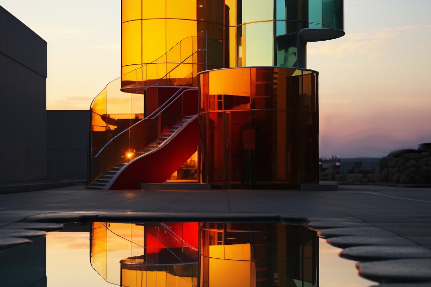
For example, warm white light (2700–3000K) emphasizes naturalness and heritage on stone facades, while neutral or cool white light (4000–6500K) highlights modernity and precision on glass façades.
The relationship between color and light defines emotional impact:
- Warm tones: welcoming, intimate, calm
- Cool tones: modern, dynamic, strong
- Neutral tones: balanced, professional, timeless
Every façade tells a story. Light is its language, and color is its emotion.
2. Color Temperature: The Key to Architectural Harmony
In exterior lighting, color temperature (Kelvin) determines both aesthetics and comfort.
Typical architectural lighting falls between 2700K–6500K:
- 2700–3000K (Warm White): ideal for historic buildings, stone façades, boutique hotels, and restaurants.
- 3500–4000K (Neutral White): best for offices, residential complexes, and commercial façades.
- 5000–6500K (Cool White): suitable for high-rise towers, malls, and glass façades.
The mix of warm and cool tones creates visual rhythm on hybrid surfaces combining materials like glass and stone.
This equilibrium is often referred to as sensory balance in architectural lighting.
3. RGBW Dynamics: The Rise of Digital Color Control
Among 2025’s most prominent trends is RGBW dynamic façade lighting.
These systems allow full digital control over color, brightness, and movement, creating adaptive visual scenarios.
- RGB: blends red, green, and blue for multi-color effects.
- RGBW: adds a dedicated white channel for accurate color rendering.
- Tunable White: enables smooth transitions of color temperature to match the time of day or event.
Such systems are now essential in hotels, museums, cultural centers, skyscrapers, and smart city projects, serving both aesthetic and branding purposes.
However, restraint is key: overuse of color transitions can make the façade visually noisy.
Balanced, rhythmic light motion using controlled tones achieves far more elegant results.
4. Material–Light Interaction: Reflection and Texture Readability
A façade’s material defines how it reacts to light.
- Light-colored surfaces reflect more light, softening contrasts.
- Dark surfaces absorb light, enhancing shadow depth.
- Metal surfaces (aluminum, steel) respond to color temperature — cool white gives a bluish tint, while warm white brings golden hues.
Hence, every lighting design should include on-site testing to verify results beyond digital renderings.
Professionals rely on the Color Rendering Index (CRI) to ensure accurate visual perception. Fixtures with a CRI above 90 preserve the building’s true textures and tones.
5. Focus and Rhythm: The Composition of Light
Good façade lighting emphasizes composition over brightness.
The goal is not to illuminate every detail but to highlight the architectural hierarchy:
- Structural outline
- Vertical elements (columns, niches, pilasters)
- Surface textures
- Logos or entry highlights
This layered approach not only saves energy but adds architectural depth and storytelling value to the building’s nighttime presence.
6. Environmental Harmony and Light Pollution Control
Sustainable lighting design is not just about beauty — it’s about responsibility.
Directional accuracy, controlled brightness, and contextual integration protect both the environment and visual comfort.
Best practices include:
- Avoiding upward light spill and glare.
- Minimizing oversaturation and contrast with neighboring façades.
- Adhering to dark-sky standards.
In 2025, environmentally sensitive design has become a global architectural obligation. Smart lighting now aligns with eco-conscious urban aesthetics.
7. Smart Control Systems: Precision in Color and Timing
Advanced lighting systems today integrate smart control units that automatically balance light color and intensity.
These enable:
- Time-based color temperature adjustment,
- Scene automation for events,
- Energy optimization through sensors and central control.
Used extensively in smart city lighting, interactive façades, and event-based illumination, such systems ensure visual coherence and operational efficiency.
8. Energy Efficiency and Sustainability
The future of façade lighting is as much about performance as about beauty.
Modern LED technology provides up to 80% energy savings while maintaining high luminous output.
Key sustainability features include:
- Low-consumption LED drivers,
- Optics that optimize light distribution,
- Recyclable materials,
- Solar-powered modules.
These innovations not only reduce costs but contribute to LEED and BREEAM certifications, reinforcing a building’s eco-identity.
9. Sensory Design and Color Psychology
Color and light affect human emotion directly:
- Red evokes energy and passion,
- Blue conveys trust and calm,
- Green reflects balance and nature,
- Purple suggests creativity and sophistication.
Thus, façade color harmony must consider emotional resonance, not just architectural expression.
Lighting design in 2025 is as much sensory as it is technical.
Conclusion: Color + Light = Identity
A façade speaks through its materials by day and through its lighting by night.
Successful façade lighting is the seamless harmony of color and light, transforming buildings into living architectural icons.
Professional lighting design is not just about seeing the building — it’s about feeling it.