- HOME PAGE
- / BLOG
BLOG
The Drama of Color Selection: Why Does Everyone Love Grey at First?
Think about the moment you decide to refresh your home, change the wall color, or redesign your interior…
You look at hundreds of colors, yet somehow you magically end up staring at grey.
This isn’t a coincidence.
It’s not just a trend.
It’s a universal psychological response.
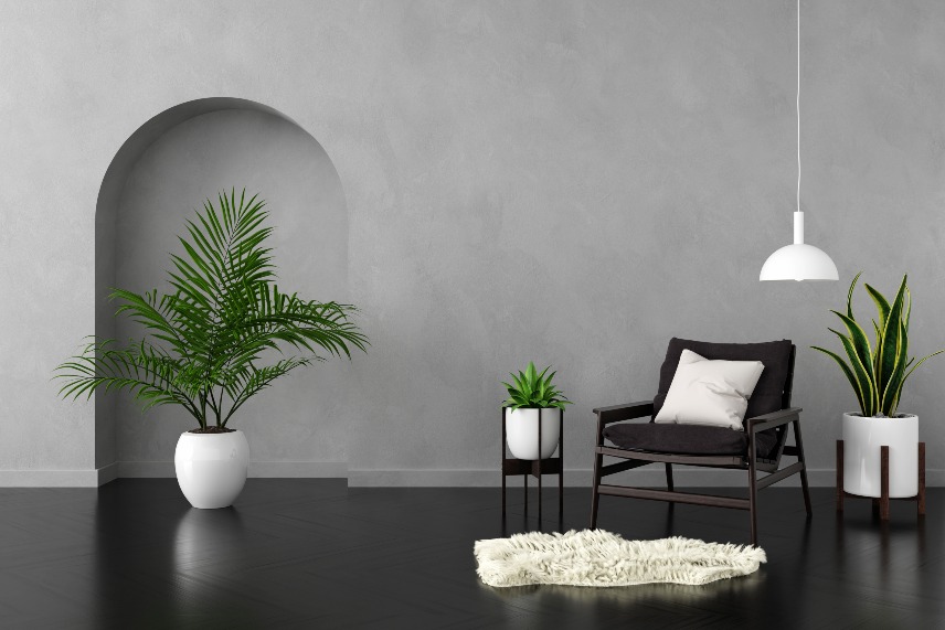
Grey has become the global “safe color” of the last decade.
Interior designers both love and fear it.
Because when used well, grey is modern, timeless, elegant;
but when used poorly, it can turn your home into:
- a cold office
- a lifeless Airbnb
- or a depressing hospital corridor
This article explains — with humor, psychology, and real interior design logic — why everyone initially loves grey, and how to use it properly.
1. Grey Manipulates the Brain: “At Least I Won’t Make a Mistake”
Color selection is way more stressful than it appears.
People are afraid of choosing wrong:
- “What if it makes the room darker?”
- “What if I get bored?”
- “What if it looks different on the wall?”
- “What if it clashes with my furniture?”
Grey solves all these fears by whispering:
“I’m neutral. I’m safe. I will never embarrass you.”
Grey does not require emotional courage.
It is a risk-free choice, and the brain loves low-risk decisions.
Grey = “This won’t go wrong.”
In decision psychology, “won’t go wrong” often means “yes, let’s do it.”
2. Instagram + Pinterest Culture: Grey Is the Camera-Friendly Hero
Grey became a star thanks to social media.
Why?
Because grey:
- photographs well
- looks clean
- matches all filters
- appears modern and minimal
- hides imperfections
- works well with staged rooms
But here's the trick:
Grey looks perfect on screen, not always in real life.
A grey room on Pinterest might have:
- huge windows
- natural daylight
- balanced tones
- professionally styled decor
Most homes do NOT have this.
So people apply the same grey and think:
“Hmm… why does this feel gloomy?”
Because the room cannot support that grey.
3. Grey Creates the Illusion of Minimalism
For nearly a decade, people equated minimalism with grey.
Because grey feels:
- simple
- quiet
- clean
- organized
But choosing grey doesn’t make a room minimalist.
Minimalism is a lifestyle — not a color.
Many homes painted full grey with lots of accessories end up looking not minimalist but like a monotone warehouse.
4. Men Tend to Prefer Grey More (Scientifically Proven)
Studies show men gravitate toward neutral colors like grey, black, white, and navy more than women.
Reasons include:
- lower emotional activation
- fewer decisions to make
- simplicity
- comfort zone
- fear of choosing the “wrong” color
This is why interior designers often hear:
“Let’s keep it simple… make it grey.”
But usually, the person wants simplicity, not grey —
they just fear committing to a color.
5. Grey in Interior Design: Safe but Also a Trap
Designers don’t hate grey — they dislike bad grey.
Good grey:
- warm undertones
- works with natural light
- blends with the flooring
- complements furniture
Bad grey:
- cold blue-grey on north-facing rooms
- grey with yellow floors
- same grey in every room
- grey + white LED = morgue aesthetic
Grey isn’t a problem.
Using it blindly is.
6. The Myth: “Grey Goes with Everything”
No, it doesn’t.
Grey clashes badly with:
- yellow wood
- pink undertones
- warm beige
- certain marbles
- yellow lighting
Most homes accidentally create color temperature wars.
This is why people say:
“Something feels off but I can’t explain why.”
Usually, the answer is simple:
Grey needs warmth, balance, and contrast.
7. Grey Is a Transition Color
Psychologically, grey is a between-phases color.
People choose grey when:
- moving
- after a breakup
- redesigning their identity
- shifting away from bold colors
- wanting change without commitment
Grey symbolizes emotional neutrality — a pause between old and new.
8. 7 Designer Rules for Using Grey Correctly
1. Analyze the room’s light before choosing grey
North light = colder grey
South light = warmer grey
2. Always test grey with your flooring
Yellow wood can destroy grey instantly.
3. Use multiple greys — not one
Layer tones:
light grey → greige → stone grey → charcoal
4. Avoid white LED lighting
Grey + white LED = hospital
5. Add textures
To keep grey alive:
linen, boucle, natural fibers, warm woods…
6. Add accent colors
Copper, burnt orange, beige, cream — these save grey.
7. Don’t make every room grey
Grey kids’ rooms = emotional drain.
Conclusion: Grey Is Beautiful — But Only When Used Wisely
Grey is modern, stylish, and elegant.
Yes, it is naturally attractive at first glance.
But this doesn’t mean every home needs to be grey.
Used well:
✔ Balanced
✔ Timeless
✔ Warm
✔ Sophisticated
Used poorly:
✘ Cold
✘ Lifeless
✘ Flat
✘ Depressing
Color selection may be dramatic,
but with knowledge and a bit of courage,
you can create a home that feels truly alive.
Latest Blogs
-
 zeysey
Construction Techniques That Stand Out in Buildings in 2025
-
 zeysey
TikTok Interior Design Tips: Which Ones Are Real and Which Are Trash?
-
 zeysey
Facebook Moms’ Legendary Home Renovation Tips: Which Ones Actually Work?
-
 zeysey
10 Interior Design Trends You Saw on Instagram — and Regretted Immediately!